

Understanding Color in HDR Displays
What is color volume? Take a closer look at color volume being an essential component for HDR and exceptional color performance, and why users and OEM brands should care.
The secret to real HDR
Color Volume is now an even more critical measure because of the explosion of availability of HDR content.
– AVS Form
Why do we need to go beyond 2D description in explaining color capbility?
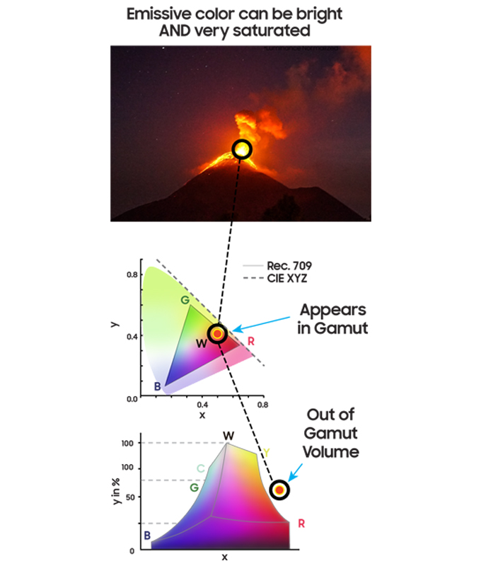
Because humans perceive color as three-dimensional. The Commission on Illumination (CIE’s) technical report, CIE 168, states: “Color gamut is a 3D property.” Despite this more general and entirely valid description, many in the industry characterize a display’s color capability using only a two‐dimensional CIE 1931 or CIE 1976 chromaticity diagram, which is generally easy to understand when only one luminance is relevant. However, the 2D approach is a limited metric. It allows a yellow (brighter) and a brown (dimmer) color to have the same chromaticity, yet they are clearly different colors.
Early on, in the age of the Standard Dynamic Range (SDR), it was a reasonable approximation to use a 2D chart to represent a display’s color capabilities. However, for modern High Dynamic Range (HDR) displays, this simplified approach falls woefully short.
The concept of “color” can be better understood if it is divided into three parts: chromaticity, hue and lightness.
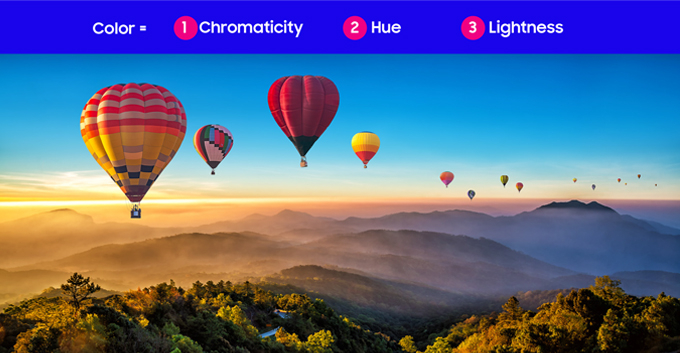
What is color volume?
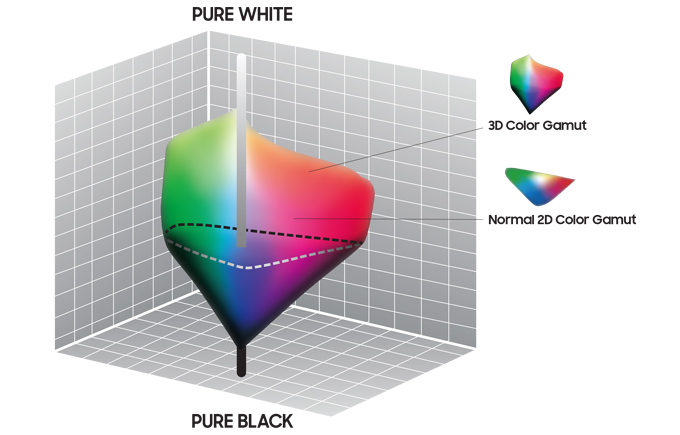
Now, how is color volume defined? Technically, it is a 3D representation of the maximum color- reproduction capabilities of a display throughout the entire range of the display’s luminance. Using this definition results in a 3-dimensional shape, or volume, as seen below.
Color Volume includes all colors throughout the entire luminosity range (not just at one specifically defined luminance plane).
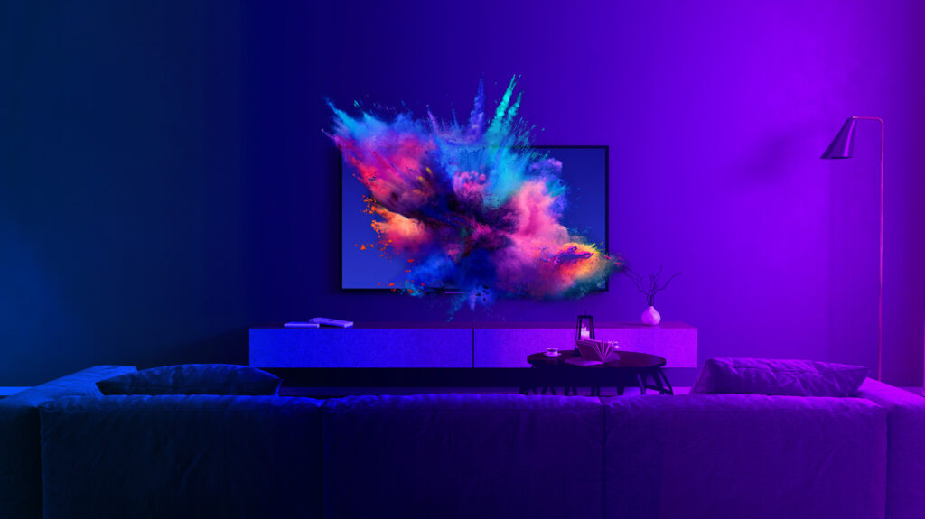
The larger a display’s color volume, the better it can express a vast range of vividly colorful imagery.
Why do you need color volume for your latest HDR display?
Because HDR displays cover a wider range of luminance levels compared to SDR displays, and because the luminance level has a direct bearing on color perception, it is best to use a volumetric description of color (3-D and not 2-D) capability. Sensitive to the confusion between 2D and 3D descriptions of color, standardization organizations are in the process of modifying documentation to use clearer terms, notably “chromatic range” or “chromatic gamut” for 2D descriptions, and “color gamut” for 3D descriptions.
Additionally, modern displays use techniques such as white peaking to achieve higher peak – luminance levels, especially for HDR. However, this approach breaks with the concept of “additivity”. Here, “additivity” means that the sum of peak red, green and blue luminance levels add up to the white peak luminance level. Since many modern displays like projectors, WOLED’s are not additive, it is even more critical to characterize color capability properly, using luminance and chroma.
How do experts evaluate HDR color performance?
The solution: Measure and evaluate both, Chromatic Gamut (often mistaken for “color gamut”) and Color Volume (true color gamut) provide a more holistic way to measure color performance.
To measure an HDR display’s full color capability, we need to expand our tool kit and adopt new concepts. “Color Volume” provides a much more useful measure of the range of a HDR display’s color reproduction capability. However, Color gamut refers only to the extent of a display’s range of color; it does not define a specific location within the display’s color reproduction range. For example, an RGBW display might not maintain an adequate amount of color saturation at higher luminance levels. To solve this problem, another metric, “Color Volume Intersection to a Reference,” can be used to evaluate how much of a 3D reference (such as % of DCI-P3 or BT.2020) can be addressed by a display’s specific color volume. The ICDM (International Committee for Display Metrology) has named this new method of evaluating TV performance “VCRC” (volume-color reproduction capability).

How to measure and visualize color performance?
(Please note that there is NO single ‘consensus’ standard today for the measurement of color volume or color performance—at least not yet. Nonetheless, our goal here is to help you get a broad understand-ing of the latest display trends.)
ICTCP
ICTCP is a format for representing color as specified in Rec. ITU-R BT.2100
Digital imaging throughout the video industry commonly uses ICtCp as coordinate systems for image processing and image conversion. It was designed to represent a closer approximation of how people perceive color. So for HDR and WCG displays, ICtCp coordinate systems comes close to representing human cognitive characteristics as possible.
The new format is derived from a RGB color space by a coordinate transformation. The transformation produces three signals called I, Ct, and Cp. Color “intensity” is best represented by a luma component that measures the brightness of video, while Ct and Cp are blue-yellow and red-green chroma components. [2]
CIELAB
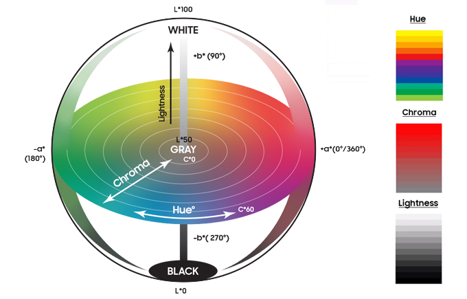
The CIELAB color space, referred as L*a*b*, is a color space to represent the magnitude of perceptually different colors. L*a*b* is one of two color spaces defined by the International Commission on Illumination (CIE), and L*a*b* is standardized in ISO11664 Part 4: CIE 1976 L*a*b* color space. CIELAB is useful for quantifying the color volume rendered by a display and developed to quantify the magnitude change in a 3-D color space that equates to a perceived change in color. While the LAB space is not perceptually uniform, it nevertheless is useful for detecting subtle differences in color.
This approach is based on the opponent color model of human vision, where red/green forms one opponent pair, and blue/yellow forms another. The lightness value, L*, also referred to as “Lstar,” defines black at 0 and white at 100. The a* axis is relative to the green–red opponent pair, with negative values towards the green and positive values towards the red. The b* axis represents the blue–yellow opponents, with negative numbers towards the blue and positive towards the yellow.
What are the user benefits?
Yes, consumers can benefit a lot. Let us take the following example: If Monitor X and Monitor Y each claim DCI-P3 99%, how can you infer “better” performance?
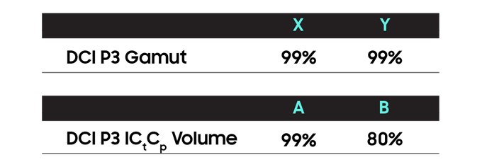
For most observers, if just restricted to 2D gamut Monitor A and Monitor B are similar. However, you would be missing a lot! B might cover the same chromatic range at a constant luminance level. Once an image sufficiently brightens, the percentage covered by Monitor B will drop significantly. Understanding the “volume” of color performance, consumers can make more informed choices.
Benefits of wider color volume?
- Greater Tone Mapping range – better performance across the entire luminosity range.
- More coverage of natural reflective colors – with QD-Display you can enjoy the most expansive coverage of natural colors!
- The greater range of color means a wider canvas for creators to create and users to consume.
- The enormous range of available colors can significantly complement whatever experience that a content creator wants to communicate. See Pixar uses hyper-colors to hack your brain!
Why should OEM brands care?
More value
Color performance is one of the features most desired by users — it commands high value and translates into a greater willingness to purchase.
Higher ratings
Consumer review site rankings can significantly impact the commercial success of a brand in the market. Many of the most popular reviews have adopted this broader definition of color performance. For example, the popular rtings.com website gives equal weight to gamut and volume coverage for HDR displays.
Why QD-OLED provides the best color performance?
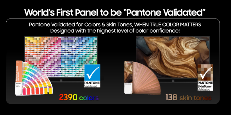
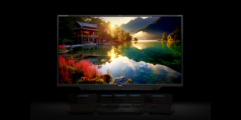
Samsung Display introduced QD-OLED, which boasts the most expansive color volume in the market. Learn more about QD-OLED products and performance here.

15 thoughts on “Understanding Color in HDR Displays”
Comments are closed.