
Color and the Human Eye
This ‘back to basics’ whitepaper will cover how color is perceived by the human eye, the defintion of color gamut and the evolution of color gamut in high-end displays.
Color and the Human Eye
A Display’s color is determined by its “Color Gamut”, “Color Depth” and “Dynamic Range”.
- Color Gamut (e.g. WCG) determines which specific colors can be displayed from a given “Color Space” (Rec.709, Rec.2020, DCI-P3) (i.e. the color range).
- Color Depth (or “Bit-Depth”, e.g. 8-bit, 10-bit, 12-bit) determines how many distinct color variations (tones/shades) can be viewed on a given display.
- Dynamic Range (SDR, HDR) determines the luminosity range of a specific color – from its darkest shade (or tone) to its brightest.
To accommodate the variations of different displays, luminance was integrated as a third dimension into the traditional 2D color gamut diagram to create color volume. Color volume is the set of all available color at all available hue, saturation and brightness.
This ‘back to basics’ first piece will cover the topics of how color is perceived by the human eye, definition of color gamut. We hope that this material will help you connect the dots.
Fascinated by industry developments in the area of color space?
Color and the human eye – what is color and how do we see it?
Color is a visual perception detected by our eye through interpretation of the light information by our brain. When the light hits an object, the latter absorbs a portion of the light and reflects the rest. Light wavelengths that are absorbed or reflected depend on the object’s properties. As the light bounces back off the object, it hits the light-sensitive retina at the back of the eye. The retina has millions of specialized pigmented cells called cones, which in humans come with three different spectra sensitivities – short, medium, and long. The cones are responsible for our trichromatic color vision.
The human eye can detect visible light with wavelength ranging from about 380 nm to 780 nm. In a nutshell, each type of cone is specializing on a particular wavelength. Red hues have longer wavelength, green – medium, and blue – short. So as the light reflected off the object hits the cones, it stimulates them to varying degrees. The resulting signal is then transmitted through the optic nerve to the visual cortex of the brain, which is responsible for color interpretation.
All colors are created as a combination of red, green, and blue hues. As the mixed color passes through the human eye, a number of wavelengths in the composition stimulates respective type of cones, which in turn initiate the optic network for recognition and interpretation. Many different combinations of light wavelengths can produce the same perception of color.
Light intensity is another important characteristic that affects how we perceive color. Color temperature is an expression of relative intensities of the various wavelengths that make up light. Color temperature is expressed in units of Kelvin (K) – and lower temperatures mean redder light, while higher temperatures produce bluer light. In this case, color is expressed as temperature because objects will radiate different light frequencies when heated to high temperature.
Color space – how do we measure the color?
In the display world, there are a number of standards for mapping color, with CIE 19761 being recommended as an authoritative display measurement standard by Society for Information Displays (SID). Chromaticity diagrams are a preferred way to map a color space as they only measure color quality, isolating other factors such as luminance. A color space is defined as a uniform representation of visible light perceived by the human eye. It maps all of the colors to a grid, assigning them measurable values of spectral absorbance, allowing for comparison between colors and description of color gamut standards.
A CIE chromaticity diagram maps the spectral distribution of light by brightness parameter and two chromaticity coordinates representing hue and saturation. All hues visible to an average person are contained inside the ‘horseshoe’ diagram. The edge of the ‘horseshoe’ – the spectral locus – represents the maximum saturation for the spectral colors that are measured by the light’s wavelength in nanometers. Line of purples is the straight line connecting both ends of the spectral locus and it represents fully saturated colors that are a combination of violet (360nm) and red (780nm). Desaturated colors are located in the center, emanating from the white. The curved line in the white region of the diagram shows absolute color temperatures in Kelvins.
The CIE diagram presented above is a visualization of the set of colors achieved using additive color mixing. When additive trichromatic system is used, a new color can be created by mixing a light of different wavelengths and varying brightness. This diagram represents the complete subset of colors visible to a normal human eye. To describe a range of colors available on a devise though, the industry uses the notion of color gamut.
Color gamut is a measure of the range of colors that a display can produce. While the gamut of the normal human vision covers the entire CIE diagram, achieving it via display technology is only possible in theory. Hence, color standards are represented as a triangle within the diagram defining the subset of colors that can be achieved by combining colors at its corners. In recent years, display color space standards have been continuously evolving with color gamut becoming progressively larger.
Color gamut standards evolution
Understanding color gamut coverage is crucial for evaluating display technology and its ability to generate true-to-life colors. The majority of display devices use the RGB color model to define the color of every pixel. The chromaticity diagram above illustrates that using these three primaries we can cover most of the color space.

RGB and sRGB
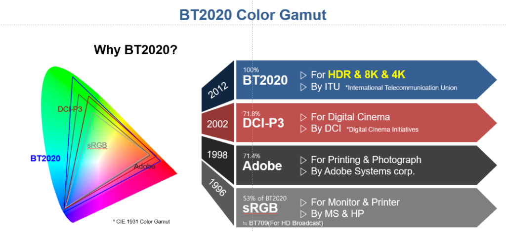
RGB standard, referred to as ITU-R Recommendation BT 709 or Rec 7092, was approved in 1990. RGB only covers 33.2% of the chromaticities of the CIE 1976 u’v’ diagram. sRGB standard was created in 1996 and uses the same primaries and white point as Rec 709. This is the most common color gamut used for consumer electronics products. This color gamut is still quite narrow and only covers 38.7% of the CIE 1976 u’v’ chromaticities.
DCI-P3
The DCI-P33 color space released in 2007 uses the same blue primary as the Rec 709 and sRGB color spaces, but it employs different green and red primaries. The red primary of DCI-P3 is monochromatic 615 nm and green primary is a slightly more yellowish hue of green, but more saturated. DCI-P3 is 26% larger than sRGB gamut and it covers 41.7% of CIE 1976 chromaticity diagram.
BT 2020
ITU-R Recommendation BT 2020, or Rec 2020 for short, establishes the widest display color gamut, requiring monochromatic RGB primaries (467 nm, 532 nm, and 630 nm). This color gamut is extremely wide – it is 72% larger than sRGB and 37% larger than DCI-P3. The resulting color space covers 57.2% of CIE 1976 chromaticity diagram.
Rec 2020 colorimetry adoption continues to grow, however, compliance needs more clear definition as 100% of this color space is not physically achievable. At this point, only a few displays have come close to providing Rec 2020 color space.
One of the most promising and realistic technologies that allow us to get closer to BT 2020 coverage requirements is quantum dot displays.
Conclusions
Wide color gamut yields most true-to-life image quality and most vibrant colors. The second series of this content covers the definition of color depth, and after that, we plan to produce color-related series sequentially for dynamic range and color volume.
References
- CIE (International Commission on Illumination) defined the original CIE standard in 1931. In its 1976 revision the standard adopted a more linear color space, minimizing variations in perceived color and making color comparisons more accurate.
- ITU-R Recommendations constitute a set of international technical standards developed by the Radiocommunication Sector (formerly CCIR) of the International Telecommunication Union (ITU).
- DCI stands for Digital Cinema Initiatives, LLC – which is a joint venture consisting of the major motion picture studios.
- Full width at half maximum (FWHM) is the method of specifying spectral width calculated as a difference between points on the spectrum curve at which the function reaches half its maximum value.
Key Terms Glossary
- Color is a visual perception detected by our eye through interpretation of the light information by our brain.
- Human eye wavelength sensitivity: human eye can detect visible light with wavelength ranging from about 380nm to 780nm.
- Color temperature is an expression of relative intensities of the various wavelengths that make up light.
- Color space is defined as a uniform representation of visible light perceived by human eye.
- Color gamut is a measure of the range of colors that a display can produce.
- Spectral locus – represents the maximum saturation for the spectral colors that are measured by the light’s wavelength in nanometers.
- Line of purples is the straight line connecting both ends of the spectral locus and it represents fully saturated colors that are a combination of violet (360nm) and red (780nm).


7 thoughts on “Color and the Human Eye”
Comments are closed.